Saturday, June 29, 2013

Design Project: Final Art Work

So our topic is "How does Technology affect our lives."
I've spent a very long time thinking about it and finally I came out with very childish sketches that my brain managed to come up with.

Sketch 1: The evolution of Technology

Sketch 2: Sucked into TV - Controlled by Technology

Sketch 3: Technology is Life - We don't need real food

Sketch 4: One robot can do EVERYTHING

Sketch 5: Technology causes obesity


I researched online as well as off. Online didn't help me much as all they showed me were things I already know but didn't inspire my hands to move. Offline however, I thought and imagined by myself. I looked at people and watched their moves. Then I thought of myself. And it came to me, if there was one I kept doing it was to use technology, so much as I cannot live without it. Even during the holidays, I am either stuck on my laptop watching my dramas or glued to the television. Out of interest or boredom I still end up with my techno buddies. Which is why I wanted to draw something that channeled me, helpless and trapped.

So the one approved is sketch 2 and this are the few pictures that helped made the final sketching come together.
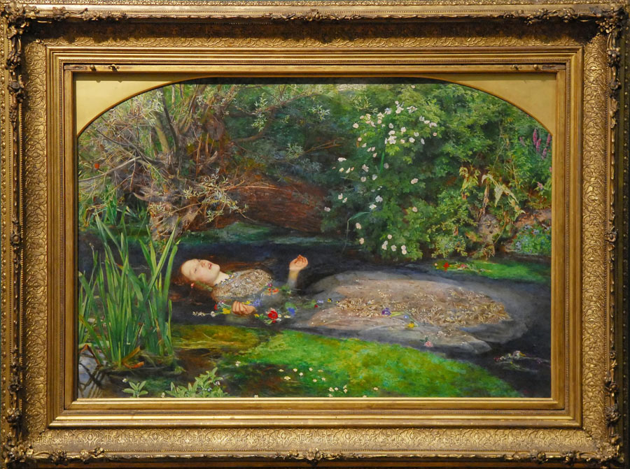
Source
This shocked woman helped me create a shocked woman of my own..

For this drawing, I wanted to show surrealism as I wanted the drawing to say that it's the one controlling us and not us them. So technically we're trapped.

Step 1: Scan and Save file as a photo with resolution 300 (This is also my official finished drawing master piece)


Step 2: Color the Lips and then the whole phone as well as laptop.


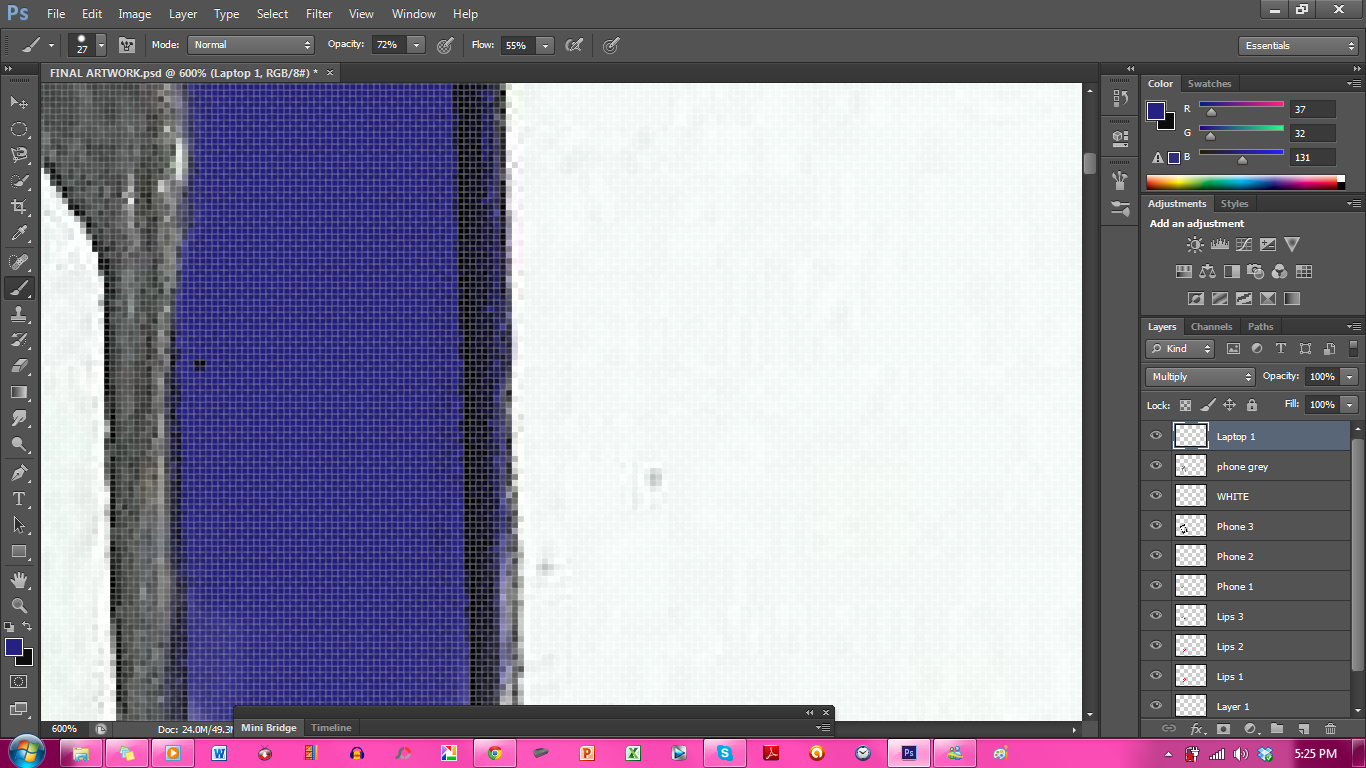
Step 3: Color the TV and all in it.


Step 4: Create threshold to enhance drawing


Step 5: Create Distorted Swirls to ad effect of being trapped. (Colors turn into black because of threshold)


Step 6: Save in JPEG and PDS file.

The colors used for this assignment is chosen because it's dramatic and speaks volumes. I drew the tv to the side because I wanted the whole thing to be in focused and not just the tv and the trapped soul.

I spent about two days on the assignment and I'm not so happy with the results because I came across some technical difficulties as well as mental blocks that prolonged the time taken to finish this assignment. 
I am proud to say however that I managed to finish it and I learned a lot in the process of finishing it.

This is my final artwork.


I hope I did alright. I put my all in it. Every non-artistic bone in my body worked together to create this masterpiece.
I can only pray that it's enough to get me the grade I want and from this class I hope to bring along all I've learn and put it to future good use.

HUGE THANK YOUS to Mr Khairul and my friends for being super patient and helpful along the way.

Tuesday, June 18, 2013

Photo Montage!

Oh I really had fun during this exercise. I came up with a few. Photo Montage is basically cropping other pictures then putting it into once picture making every picture in that picture related and under the same theme. Lol. You get me? I love this exercise!


Vin Diesel in at the beach yo! And ET flying home, surrounded by gorgeous clouds lighted by the moon light ^^

Sunday, June 16, 2013

POP ART!

So we learned how to do a pop art and it's not so easy. It is fun to do though. We had to use our own picture and this is the result of my first attempt ^^


I call it "How Do You Like Me Now!"
Thank God it received Mr. K's approval. This made me miss my straight hair. lol

Saturday, June 15, 2013

Pattern Exercise


This is the outcome of my pattern exercise. I spent 3 hours thinking and coloring. At first it was a rocket, Can You See the Rocket?? But then I realise we had to incorporate some elements and the art didn't look so balanced. So I added more shapes and VOILA!

Because we were given the task of coming up with a simple patterns using shapes, I used the basic shapes; triangles, circles, squares and rectangles.

National Art Gallery

So on the 8th we visited the National Art Gallery. I must be honest and say I didn't quite enjoy the art there at first. But after a few floors, down to the last two, I was beginning to love it. Maybe because the art displayed at the lowest floors were more modern and fun.

There were a few art that captured my attention.

First, It was Pago-Pago by Latiff Mohidin.
It was a picture of several boats and kayak stacked on each other. At least, that's what I thought it was. The boats were painted in simple shapes and it's design was a bit Red Indian inspired. The background is a big sun, I think it was setting because it's in orange. And also some leaves by the left corner. The colors used are dark and a bit heavy. Maybe because there was shadows and a mixture of colors.
The stacked boats and kayak was in the middle of the picture therefor making it the focus. I do wonder what is the significant of the stacking.

Second painting is Mindscape by Latiff Mohidin.
It was a huge archway that takes up the whole canvas. In the archway which was shaped like a long semi circle, was another long semi circle but it's smaller. Long semi circle meaning, think semi circle but vertically long.
The colors were a mixed of blue, red, orange, yellow, black and white. The whole archway was randomly painted the colors in random directions.
This painting reminded me of a mirror. Only this mirror showed me a hint of what heaven and hell can be like. For me this art really sent me a message. I got that one bad mistake or fall and we can go right to Hell as we only have one shot. Heaven is forever in front of us. It's just that step we take.
SUPER ADORE THIS ART!

Third painting is Wong Woan Lee's Someone Forgotten.
This painting showed 3 different scenarios of an old man that laid on the floor at the bottom of the art.
Above the man showed the same old man dying alone while thinking of the past probably and here there was also a window with 2 people staring in, I wonder why didn't they come in and help the old man. And the other two surrounded by family and is happy.
The painting was painted with little bright colors. Everything was mostly in brown and orange. It felt as if the sun was setting here.

I took a few pictures at the gallery. My favorite of this drawing of the Korean Show Running Man's cast. ^^


This trip taught me that art is art because of the feelings a paint can give you and how one art cannot be perfectly duplicated because the artist made it with real raw feelings at that moment.
Oh I also felt that I can do better than some of the paintings there because I really did not understand how that painting is art. :(

Thursday, June 13, 2013

(Art Movement) Pre-Raphaelite Brotherhood

After going through the list of art movements that exist, I found two that I liked very much.
Art Nouveau and Pre-Raphaelite Brotherhood.

Now because we were required to choose one that inspires us or attracts our attention the most, I've sat down and stared at the beautiful artworks by both movements and found Pre-Raphaelite Brotherhood to be simply beautiful.

The Pre-Raphaelite Brotherhood is art movement founded in year 1849 and it exists because a group of students from the Royal Academy of Arts who felt that the teachings of the academy and rejected the accepted style of painting which idealized nature and beauty to the detriment (the state of being harmed or damaged) of truth. They were basically unhappy with what was being taught and exhibited in the Academy.

The Brotherhood consisted of William Holman Hunt, D.G. Rossetti, John Everett Millais, William Micheal Rossetti, James Collinson, Thomas Woolner and F.G. Stephens. They hoped to re-vitalize paintings in Britain.

The Brotherhood found purity and honesty from the early Renaissance paintings. They drew on Shakespeare, Tennyson, Browning and Dante.

The Pre-Raphaelite Brotherhood was inspired by Italian arts from the 14th and the 15th century.

Their four declarations was;

  1. to have genuine ideas to express
  2. to study nature attentively to know how to draw them
  3. to sympathise with what is direct, serious and heartfelt in previous art, to the exclusion of what is conventional and self-parodying and learn by rote
  4. most indispensable of all, to produce thoroughly good pictures and statues. 


Source

This is called the "Isabella." It was one of the Brotherhood's first famous painting. It was painted by Millais. They used really strong colours and used a white background instead of a coloured. The girl looks like she's floating in the water and for a painting from 1850s, the colours are very strong and the picture looks almost real. The girl is obviously from that era too, what with her dress and features.

A few of my favorite paintings from this movement are;

Source
 This is Atlas Turned to Stone by Edward Burne-Jones. I loved the colours and details in this picture.


Source
This one is called Lady Godiva by John Collier. When I look at this picture I really wonder what was going through the artist's mind. I felt it tried to show a woman's true and mighty beauty but at the same time showing a woman as a humble being despite being so beautiful.

Source
This picture is The Siren by John William Waterhouse. I cannot really tell is the person in the water is a male or a female. I think it's a man staring at the woman's naked beauty.

This art movement for me screams originality and boldness. They painted with their hearts and I felt every picture had a deep meaning and represented something they wanted to show the world. I also liked how they painted the people in the picture. I really takes me back to Shakespeare times and to Britain. The painting makes you want to be in the painting or right next to the artist, asking him why is he painting it that way.

Wednesday, June 5, 2013

Picture with a Message

Source
This picture first caught my attention because of this little kid's tears. For me, this little kid is looking at he camera in a very vulnerable and sad way. I feel that he has not had the enjoyable childhood children are supposed to have. If anything, he looks like he comes from a poor background with very little to eat and filled with a lot of sadness.

The fact that this picture was taken in black and white only strengthens the emotions that are spilling out of the picture. He's overall features show the hardship he has gone through as his cheekbones and collar bone are showing very sharply.

I feel this picture takes the viewers into a world where we realise not everyone have the same luxury or luck. This picture is able to tell a story and make people realise that there are little kids like him, somewhere out there and they either have no food to eat, been used or have no opportunities like we have.

What I like about this picture is the simplicity of it. It lets the little kid speak on it's own leaving the world to interpret the cause of his sadness on their own.

This picture made me realise that I should be grateful for all that I have in life and if I am able, I should reach out to little kids like this to give them something back. Be it food, clothes or money.